No products in the cart.

Whether you’re promoting a grand opening, advertising a sale, announcing an event, or branding your storefront, 13oz vinyl banners remain one of the most powerful and cost-effective marketing tools available. At Print Standard Point, New York City’s go-to printing company, we’ve produced thousands of vinyl banners for businesses, nonprofits, events, and individuals across the five boroughs and beyond. Through years of experience, we’ve learned exactly what separates a banner that turns heads from one that gets ignored.
This complete guide will walk you through everything you need to know about designing an effective 13oz vinyl banner — from understanding the material itself to choosing the right fonts, colors, and layout strategies that make your message impossible to miss.
Before diving into design, it helps to understand the material you’re working with. Vinyl banners are measured by weight per square yard, and 13oz vinyl is the industry standard for most outdoor and indoor applications. It strikes the perfect balance between durability and flexibility — heavy enough to withstand wind, rain, and UV exposure, yet light enough to hang, roll, and transport with ease.
At Print Standard Point, we print on premium 13oz scrim vinyl, which features a reinforced mesh weave internally that adds tensile strength. This makes it ideal for:
Understanding the material matters for design because vinyl banners are typically viewed from a distance. Unlike a flyer or brochure that someone holds in their hands, your banner needs to communicate clearly from 10, 20, or even 50 feet away. Every design decision you make should keep that viewing distance in mind.
The most common mistake we see at Print Standard Point is artwork submitted at the wrong resolution. Many customers design their banner at screen resolution (72 DPI), which looks fine on a monitor but prints blurry and pixelated at full size.
For vinyl banners, always design at 100–150 DPI at full size, or if your software struggles with large canvas sizes, design at half the final dimensions at 150 DPI. Professional design software like Adobe Illustrator, Photoshop, or InDesign works best. If you’re using Illustrator, keep all text and logos as vector artwork so they scale infinitely without any quality loss.
Standard banner sizes we print at Print Standard Point include:
Always set up your file with a bleed of at least 0.5 inches on all sides and keep critical content like text and logos at least 1 inch away from the edges. This ensures nothing important gets trimmed or hidden behind grommets and hems.
Great banner design is about hierarchy. Your viewer has only a few seconds — sometimes less — to absorb your message as they walk or drive past. Structure your layout so the most important information hits first.
Follow the “Three-Second Rule”: If someone can’t grasp your core message within three seconds, redesign it.
A strong banner layout typically follows this hierarchy:
At Print Standard Point, we advise our NYC clients to resist the urge to pack too much information onto a single banner. White space is not wasted space — it gives the eye room to breathe and actually makes your key message stand out more. A banner cluttered with text, images, and graphics ends up communicating nothing effectively.
Font selection can make or break a vinyl banner. Beautiful, ornate scripts that look stunning on a wedding invitation become completely unreadable on a 3×6 banner viewed from across the street.
Rules for banner typography:
Color is one of your most powerful tools in banner design. The right color combination creates instant contrast that grabs attention, while poor color choices cause your banner to blend into the visual noise of New York City’s busy streets.
High-contrast color combinations that work best for banners:
At Print Standard Point, we print using high-quality UV-resistant inks that maintain vivid color outdoors. However, keep in mind that colors on your screen (RGB) will be converted to CMYK for printing. Always design in CMYK color mode from the start to ensure what you see on screen closely matches your final printed banner. If you have specific brand colors, provide us with Pantone (PMS) references for the most accurate match possible.
Avoid these common color mistakes:
Photography and graphics can elevate a vinyl banner tremendously — but only when used correctly. A low-resolution image that looks acceptable on your phone will look terrible printed at 3 feet by 6 feet.
Image resolution requirements: All raster images (photographs, PNG files) must be at least 150 DPI at the final print size. If you’re unsure whether your image is high enough resolution, bring it to our Print Standard Point location in NYC and we’ll assess it for you before anything goes to press.
Best practices for banner graphics:
A well-designed banner also accounts for how it will be hung or displayed. At Print Standard Point, we offer several finishing options that impact where you place key design elements:
When designing, visualize how the finished banner will be displayed and account for any hardware that may overlap your artwork.
At Print Standard Point, we’ve built our reputation on delivering sharp, vibrant, durable vinyl banners that help New York City businesses stand out in one of the most competitive markets in the world. We offer:
Whether you’re a small business in Brooklyn, a restaurant in Manhattan, an event organizer in Queens, or a contractor in the Bronx, Print Standard Point has the expertise and equipment to bring your vision to life.
Designing an effective 13oz vinyl banner isn’t just about making something that looks nice — it’s about creating a communication tool that works hard for your business. Keep your message focused, your fonts bold and legible, your colors high-contrast, and your images crisp. Set your files up correctly from the start, and always account for how and where your banner will be displayed.
When you’re ready to print, Print Standard Point is here to make the process smooth, fast, and stress-free. Contact us today and let New York City’s trusted printing experts help your brand make a lasting impression.
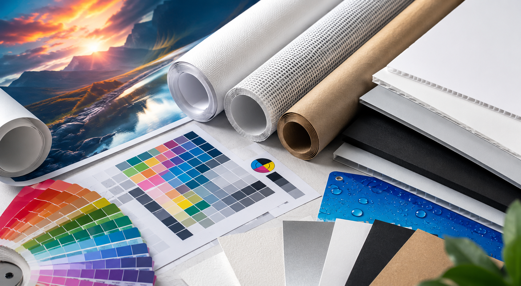
When it comes to printing, the material you choose can make or break your final result. Whether you’re
In today’s competitive marketplace, visual presentation plays a critical role in shaping customer
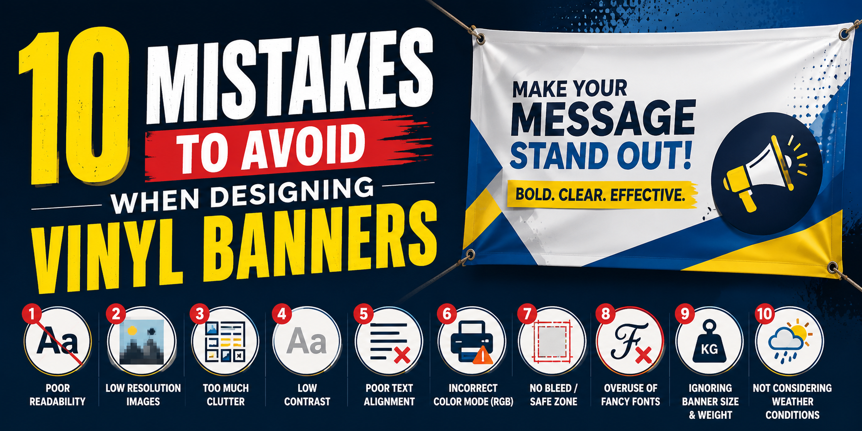
Designing a vinyl banner sounds simple enough — pick your colors, add your logo, write your message,

When you invest in event signage, you want every inch of it working for you. For banners that hang from
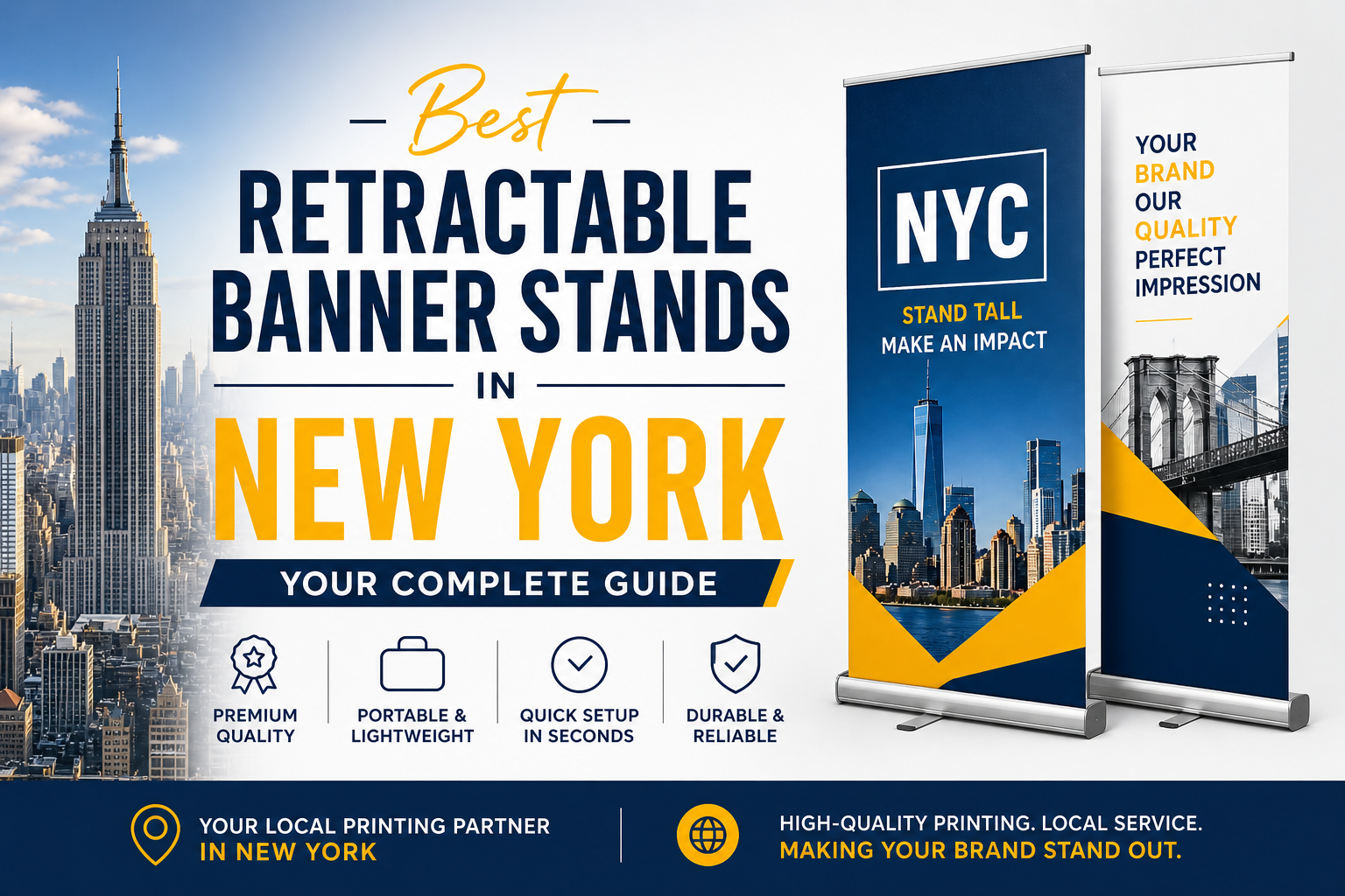
For businesses seeking a practical and professional display solution, banner stands retractable designs
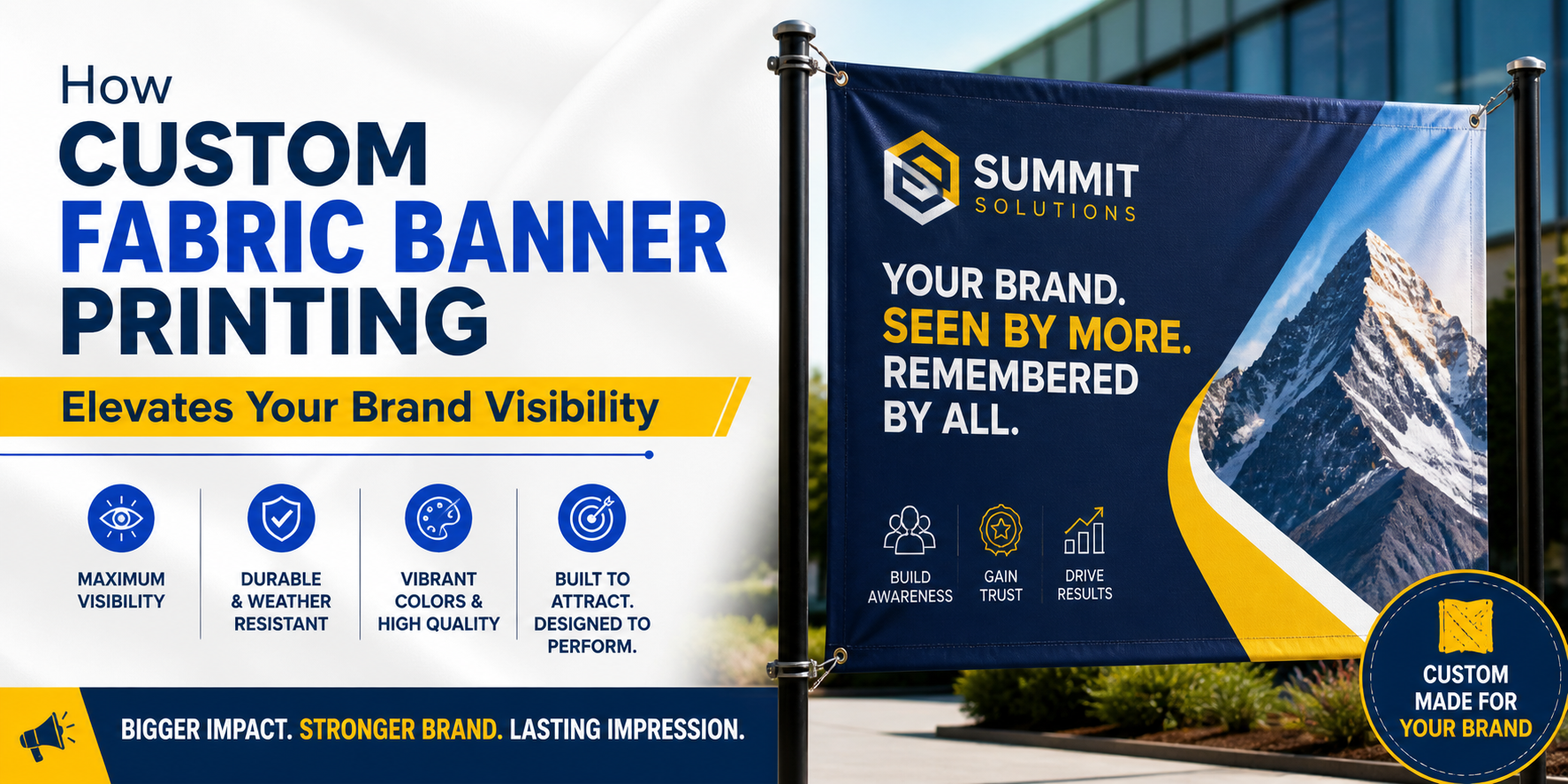
When it comes to making a lasting impression at events, storefronts, or trade shows in New York City,





